In September 2023, the Staff Senate Strategic Plan Committee began working to create a strategic plan to set the Staff Senate up for success in the coming years. Part of this work included a survey to staff members and an in-person discussion in December 2023. The first draft of the plan focuses on three main themes: communication, collaboration, and campus and staff climate.
The in-person feedback session will be held on April 23 from 10 a.m. to 11:30 a.m. in the Claxton Room of the Elliott University Center. Staff members can also provide feedback through a survey form here.
The goal is to have the plan approved by the Staff Senate in June 2024.
Spartans Thrive Takes Wellness Beyond the Expected
Posted on April 16, 2024
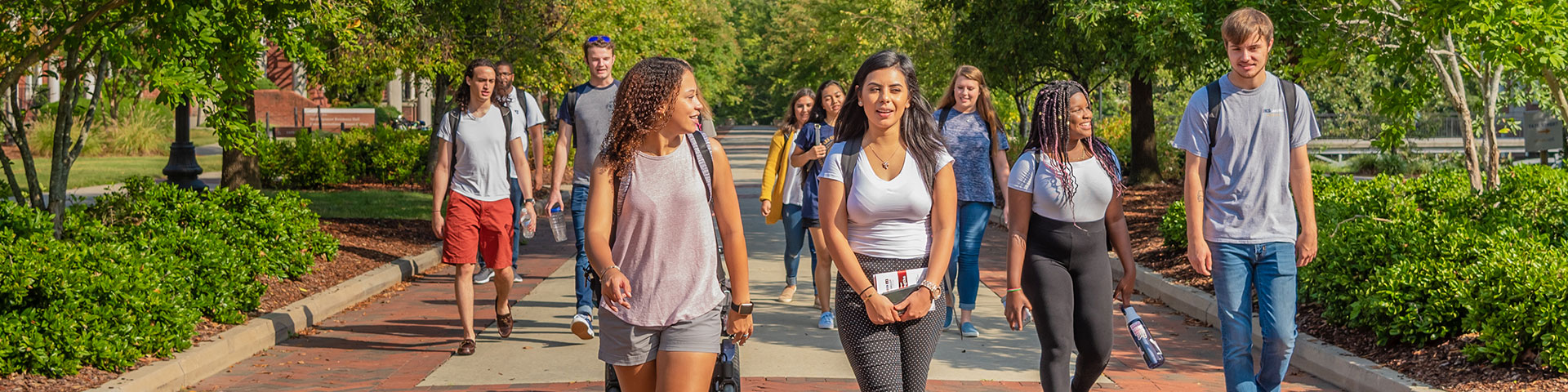
Since the start of the spring semester, 636 new mentorships have been formed. It’s part of the foundation of health and wellness UNCG is laying to help students flourish in and outside of the classroom.
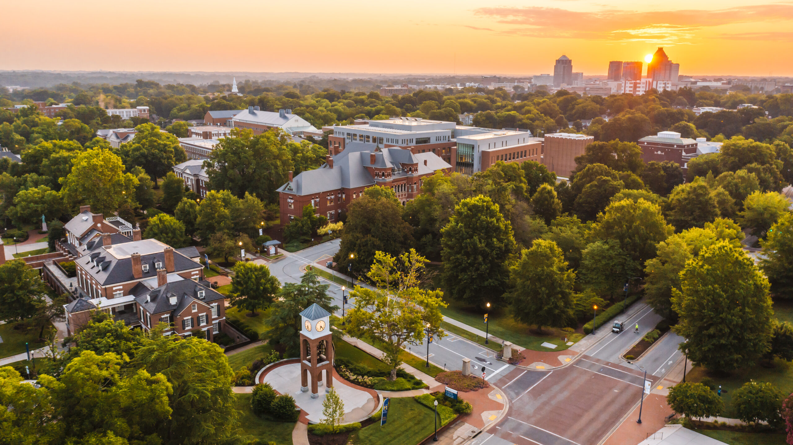
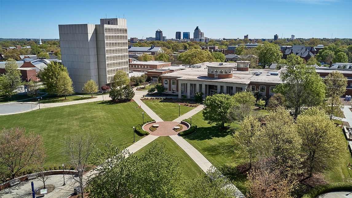
Construction to Improve Chilled Water Begins This Summer
Posted on April 15, 2024
UNC Greensboro will complete the main campus chilled water loop in multiple phases and aims to have all improvements completed in early 2025. Some streets, pedestrian paths, and parking spots will be unavailable as construction moves across campus.
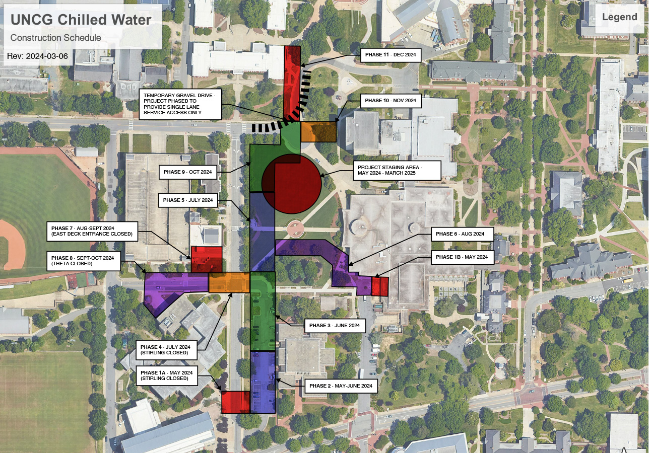
The chilled water loop project will connect Mossman Building, Elliot University Center, Walker Avenue Parking Deck, and Bryan Building to the loop. These buildings are currently supported by self-contained systems. The loop will increase air conditioning capacity, reliability, and provide efficiencies that will reduce energy costs and the campus carbon footprint. During this project, contractors will also replace the Mossman Building’s roof.
Construction will begin the week after Spring 2024 Commencement.
Note: All dates are current best estimates and will be updated regularly as conditions change.
The Construction Mobilization and Staging Area for materials and contractor access will go in the Northern Section of Kaplan Commons. It will be fenced in only through May 2024-March 2025 but remain through the Jackson Library Renovation project with its anticipated completion in December 2027.
This map illustrates the sections of underground piping and building connections per the baseline construction schedule. Accessible pedestrian paths will be maintained with clear and visible signage demarcating pathways. Drivers will be rerouted as necessary at each phase.
Phase 1A: May 2024
The south end of Stirling Street will be closed and fenced off on May 6, a few yards north of the south entrance to Mossman parking lot. Walker Parking Deck’s Stirling Street entrance will be accessible via Theta Street. Through the summer, Mossman Parking Lot will also be partially occupied by contractors replacing the Mossman Building roof.
Mossman lot permit holders and guests will be contacted by POCAM and apprised of changes and selection of available parking locations for Summer 2024. A minimum number of accessible spaces, and guest parking will be maintained in the northeast corner of the Mossman lot.
Phase 1B:
Preliminary work will start on a chilled water entry into the EUC mechanical room. The EUC loading dock area will remain open, but there will be additional construction traffic in this area.
Phase 2: May-June 2024
Stirling Street will re-open. Chilled water construction activity will move to the south end of Mossman Parking Lot. Mossman roof replacement construction will require access to the north end of Mossman lot for material staging and equipment for transporting materials.
Phase 3: June 2024
Stirling Street will remain open. All chilled water construction will be occurring in the north end of Mossman Parking Lot and the roofing contractor will be occupying the south end of the lot. Mossman lot permit holders and guests will be apprised of available parking locations. A minimum number of accessible spaces, and guest parkingwill be maintained in the southeast corner of the Mossman lot for the remainder of the Summer.
Phase 4: July 2024
Stirling Street, Theta Street from the Walker Deck entrance to Stirling Street, and Mossman Parking Lot will be closed. Mossman Lot permit holders and guests will be apprised of available parking locations. Walker Deck will be accessible from Theta Street and Walker Avenue.
Phase 5: July 2024
Mossman Parking Lot will remain closed to allow the roofing contractor to finish construction. Walkways between Stirling Street and EUC will be closed. Stirling Street will remain closed at Theta, and Theta will also remain closed.
Phase 6: August 2024
The diagonal walkway between the Kaplan Commons pedestrian circle and Theta Street will be closed. The south half of the EUC patio area will be closed. Theta and Stirling streets and the Mossman Parking Lot will re-open.
Phase 7: August-September 2024
The entrance and exit to Walker Deck connecting with Stirling Street will be closed. Theta and Stirling Streets will remain open in August. Theta will close again in September.
Phase 8: September-October 2024
Theta Street remains closed and the Theta Street entrance/exit to Walker Deck will close. Stirling Street will be open.
Phase 9: Late October 2024
Theta Street and Walker Deck will re-open for the remainder of the project. Walker Avenue Circle will have one lane open only for essential deliveries at the Library tower and Moran. All bus services, including the Spartan Chariots, will have their stops relocated from the circle to Stirling Street.
Phase 10: November 2024
Spartan Chariot bus service will continue to be relocated to Stirling Street. Deliveries through the traffic circle will remain one lane only on a limited basis.
Phase 11: December 2024
Pedestrian traffic from Shaw and the Quad will be detoured around the normal path on the southeast corner of the quad. Deliveries to Moran and the library will remain on a limited one lane basis. Spartan Chariot bus service will remain relocated to Stirling Street.
Final landscaping will occur in Spring 2025 when the weather will be more conducive to good plant growth.
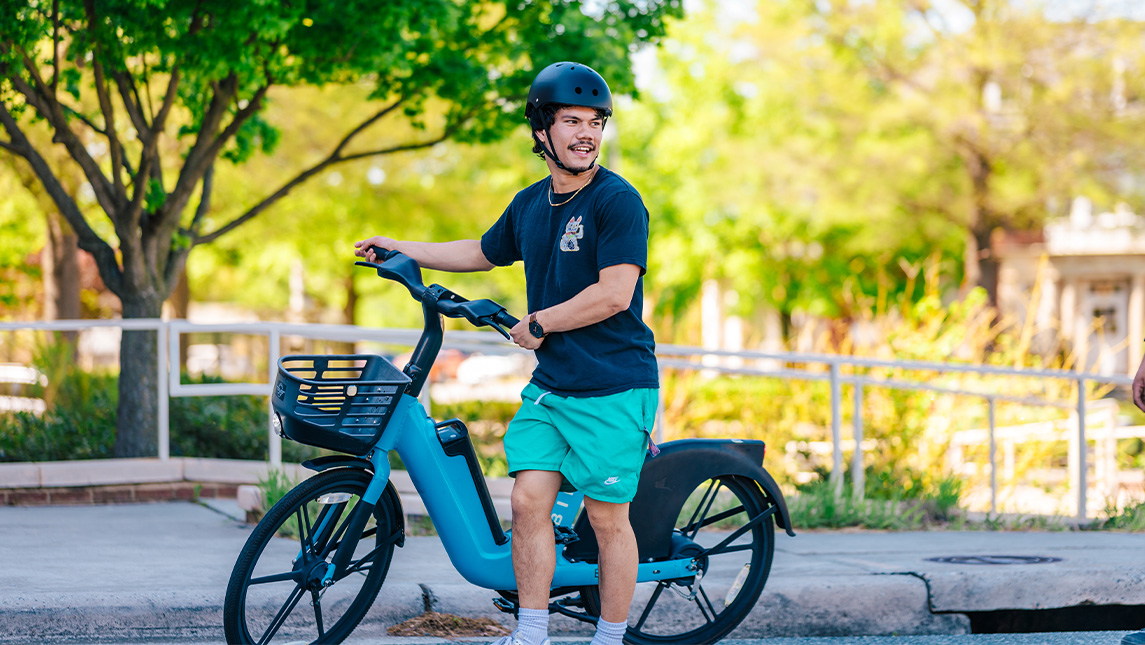
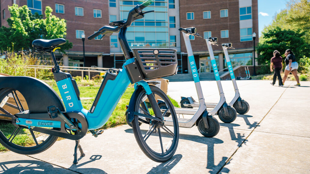
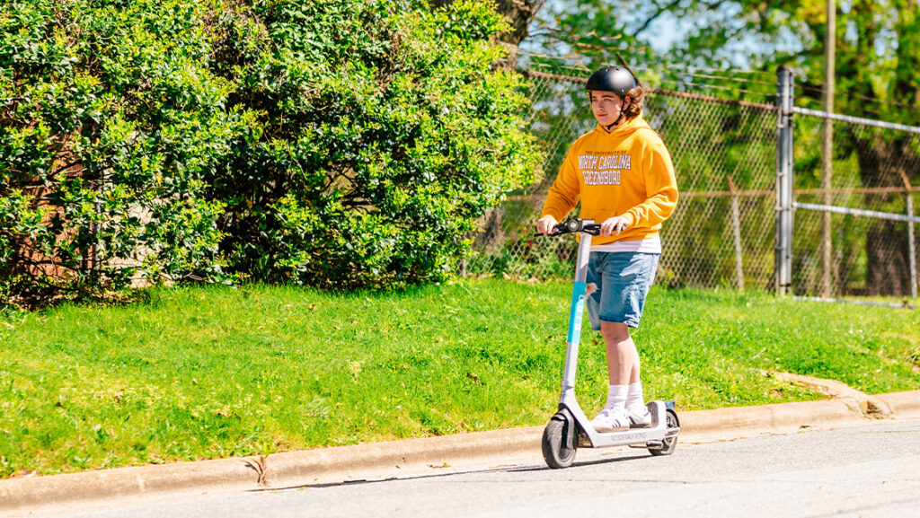
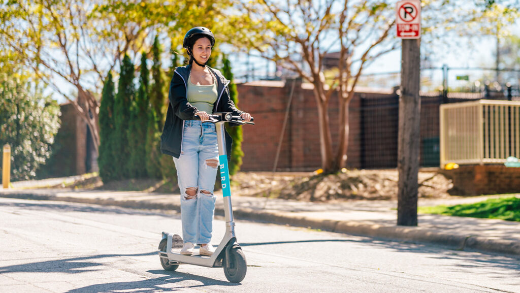
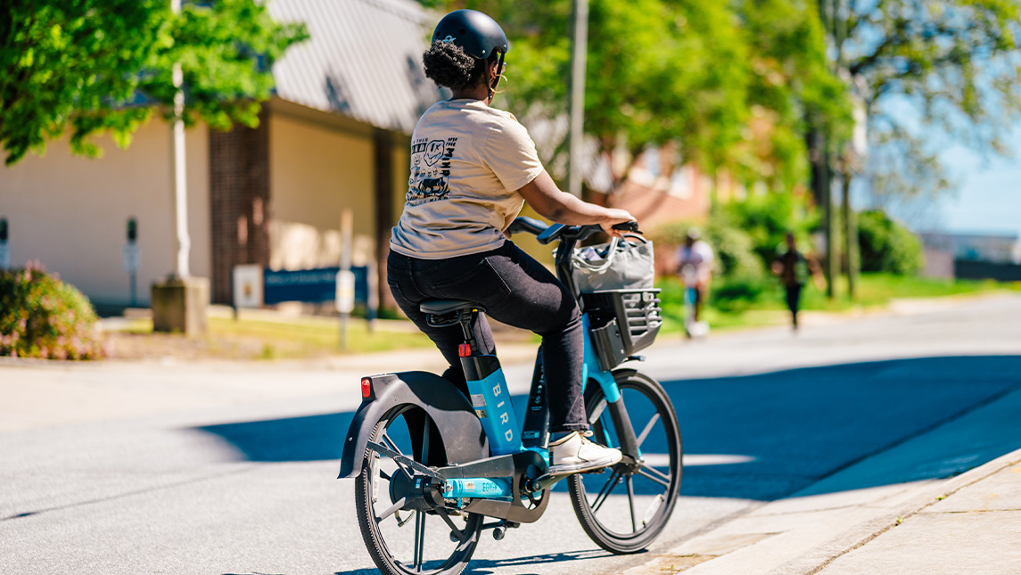
Eco-Friendly Scooters and Bikes Now Available for UNCG Students
Posted on April 15, 2024
UNC Greensboro and the City of Greensboro have individually partnered with Bird, a leader in environmentally friendly electric transportation. Through the partnerships, shared e-scooters and e-bikes are now available to UNCG students and city residents. The eco-friendly, affordable transportation option can be activated through Bird’s free mobile phone application and used to replace gas-powered car travel.
Bird e-bikes and e-scooters on the UNCG campus.
“Spartans are environmentally conscious, and with Bird’s e-scooters and bikes, UNCG can now provide convenient, eco-friendly transportation on designated streets through our beautiful campus and into Downtown Greensboro,” says Grant Harris, transportation and event manager at UNCG. “With nearly half of our undergraduate students being Pell eligible, Bird’s community pricing for e-scooters and bikes provides our students with another cost-efficient mode of transportation in addition to University buses.”
UNCG faculty, staff, and alumni are also eligible for a 25% discount from Bird. The e-bikes and e-scooters are now available at UNCG and in the city of Greensboro. UNCG affiliated individuals must sign up with their uncg.edu email address.
For user safety, helmets are required when using a Bird e-scooter and e-bike. To encourage proper use of the e-bikes and e-scooters, they will operate in designated areas within the City of Greensboro and UNCG. On UNCG’s campus, users are required to use designated parking areas when their ride is complete. Citizens can report issues, from maintenance to improper parking, directly through the Bird app.
“The City of Greensboro is committed to providing residents safe, seamless and equitable transportation choices. Shared-used scooters and bikes give residents more options to get to work, school, and play. This partnership with Bird is just one more way we are making Greensboro a car-optional city,” said Greensboro Transportation Director Hanna Cockburn.
Bird aims to make cities more livable by reducing car trips, traffic and carbon emissions. The company’s scooters, developed by an in-house team of leading engineering and vehicle design experts, offer residents without cars another transportation option.
“We applaud the City of Greensboro and UNC Greensboro for their commitment to offering convenient, environmentally friendly and reliable transportation options to residents and visitors,” said Austin Marshburn, head of city and university partnerships at Bird.
Bird is proud to offer a number of features and benefits to riders in Greensboro. Some of which include:
Community Pricing: Bird’s inclusive Community Pricing Program offers a 50% discount to low-income riders, Pell grant recipients, select local nonprofit and community organizations, veterans and senior citizens. Those who qualify can sign up by downloading the Bird app, creating an account and emailing proof of eligibility to access@bird.co.
Community Mode: Bird values community input. Anyone with a Bird account can report or provide feedback on vehicle-related issues such as poorly parked or damaged vehicles in their area by tapping the yield sign on the bottom left of the in-app Bird map. When a report is submitted, someone is assigned to correct the issue.
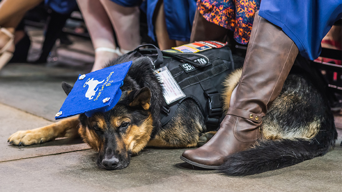
In accordance with State law, service animals assisting students with disabilities are permitted in all facilities where students are allowed of the university.
A service animal is defined as an animal that is individually trained to do work or perform tasks for the benefit of a person with a disability. A disability may be physical, sensory, psychiatric, or intellectual, and may not be apparent from visual observation. The work or tasks performed by a Service Animal must be directly related to the person’s disability.
UNCG seeks to be a welcoming environment for all service animals and service animals in training, and to remain in compliance with federal law regarding service animals. The Office of Accessibility Resources & Services (OARS) provides information on what all faculty and staff may or may not do with a service animal on campus:
Service Dogs
If you see someone with a dog and want to determine if it is a service animal, at this time, there are onlytwo questions that may be legally asked:
Is this a service dog needed due to a disability?If “YES,” you may not ask about the disability, nor for any verification. If “NO,” you may continue with further questions; e.g., “Has this dog been approved to be in this location with you as an accommodation for a disability?” In this case, feel free to check with OARS for verification.
If yes to #1, then: What task is it trained to perform?You may not ask for a demonstration.
If it is obvious that the dog is a service dog (e.g., Guide Dog), no questions may be asked. A service dog is not required to wear identification as a service dog. Any such verification is not proof that the dog is a service dog and is not recognized by either the Americans with Disabilities Act (ADA) or the Department of Justice (DOJ).
A Service Dog is a working animal. The service dog and its owner are a working team. A service dog remains with its owner while the service dog is working.
Do not pet the service dog when it is working. Petting distracts the dog from its job and the owner could get hurt. Also, don’t call the service dog by name when it is working as this, too, is distracting.
Do not offer the service dog food or other distracting treats without the owner’s permission.
Service dog owners want dog lovers to know it’s not all work and no play for service dogs. There are times when it is okay to pet a service dog. Typically, the dog is considered on-duty if wearing a harness (although the dog may be on-duty and not wearing a harness; it may be leash or voice-controlled). When off-duty, the service dog is playing and is just an ordinary dog. However, please ask the service dog owner if it is okay for you to join in before you start playing with the service dog.
Service dog owners do not want people to be afraid of their service dogs. Service dogs are well trained and under their owners’ command. Sometimes a service dog will make a mistake and must be corrected to maintain its training. This correction usually involves a verbal admonishment coupled with a leash correction. Service dog owners learn the appropriate correction methods to use with their dogs.
Service dogs go where their owners go: inside campus buildings and offices, inside the residence halls and rooms, in classrooms, in public restrooms, and in the cafeteria, for example. When the student service dog owner is seated, the service dog will stay by the student’s side. The service dog will sit at the student’s feet, next to the student’s chair, or sometimes – if the service dog can fit – underneath the student’s chair. Occasionally, a service dog is trained to provide pressure therapy to the owner. In such cases, the animal may appear to jump on the student or need to jump on adjacent furniture to perform this task. Others may be small and carried in chest packs to be able to detect changes in insulin levels, heart rate, etc.
Service dogs will not interfere with introductions or friendships. Service dog owners learn to care for their service dogs: to feed, bathe, and clean up after them.
Training organizations and people training a Service Animal have the same access rights as people with disabilities using a Service Animal, but must be identified as a Service Animal in Training.
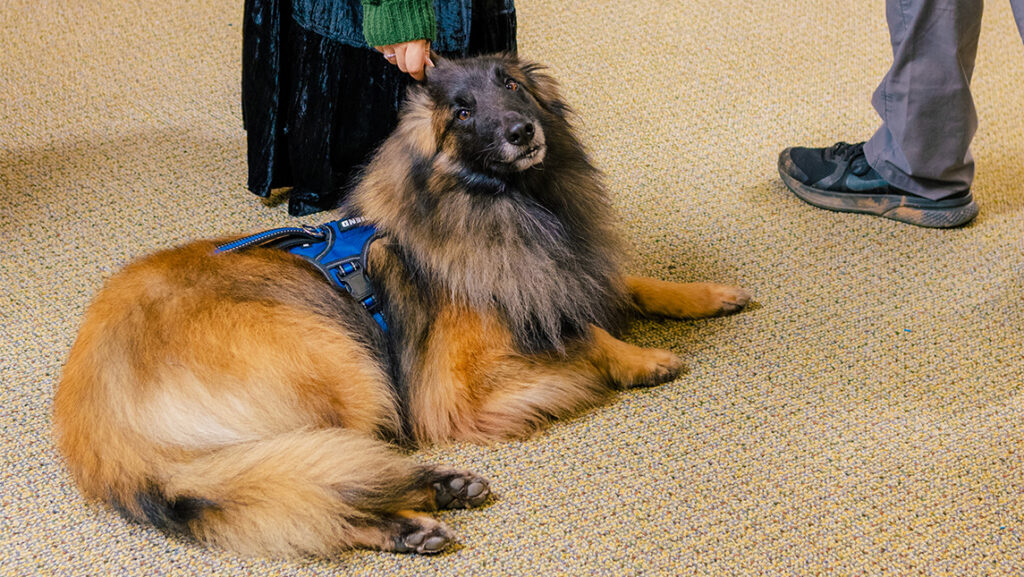
Emotional Support Animals
Left: Therapy dogs visit the School of Education’s Teaching Resources Center. Right: Odin serves as UNCG Police’s comfort dog.
An emotional support animal (ESA) is an animal of any species that, by its mere presence, provides comfort and/or support to an individual with a disability. An ESA is an accommodation and therefore, must be approved via OARS.
The Fair Housing Actrequires that ESAs be considered a reasonable accommodation in campus housing. To be approved for an emotional support animal, students must comply with UNCG policy. If an animal is disruptive, we may ask the owner to obtain control and/or resolve the disturbance. If persistent, we may require the owner to escort the animal off campus.
NOTE:Neither service dogs nor ESAs are required to wear a vest, ID tag, or special harness.
ESAs may accompany their owners while in the owner’s housing area. ESAs are not typically allowed in other areas of campus, except on a case-by-casebasis, for which an accommodation letter would be provided.
Please contact OARS at 336.334.5440 if you have any questions or concerns about service dogs at UNCG.
The UNCG Policy contains rules and guidance for all animals on campus grounds, which can be read here. The Higher Education Mental Health Alliance provides more information related to the current issues and trends surrounding animals on campus here.
Photography by Sean Norona and Jiyoung Park, University Communications
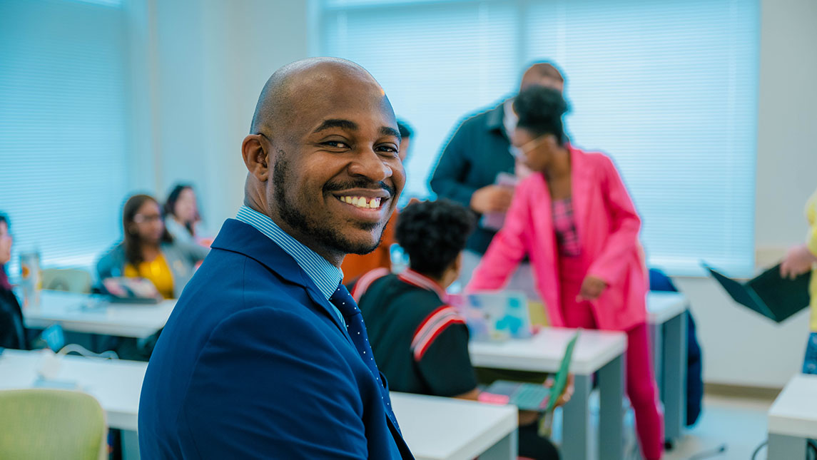
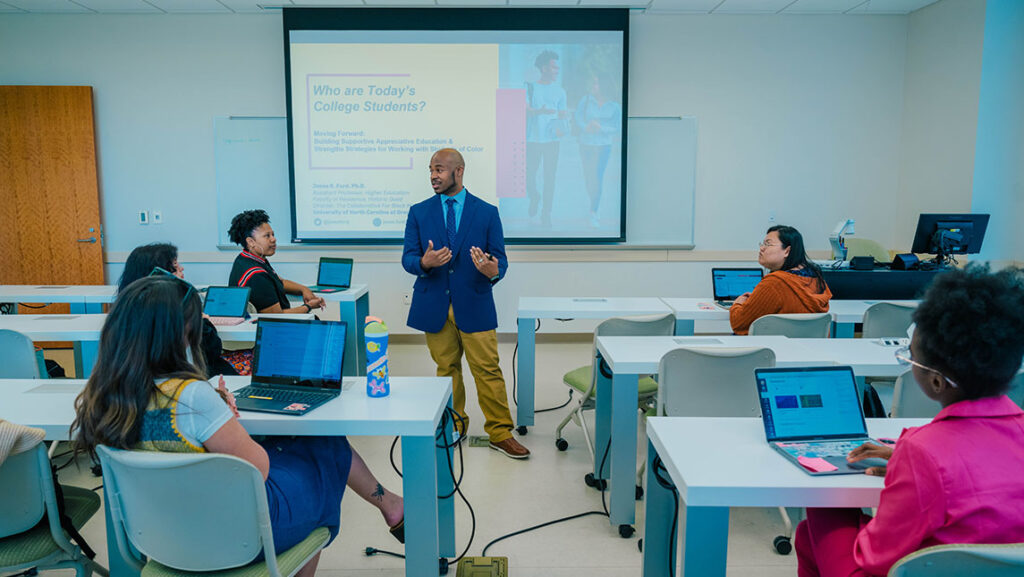
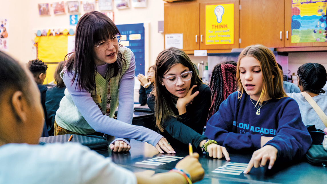
UNCG Assistant Professor Jesse Ford’s efforts to better position Black men for success include a Fall 2024 undergraduate course on leadership and more.
The odds seem to be stacked against Black men in college: Just 40 percent who enroll in undergraduate programs complete their degrees within six years. But at UNC Greensboro, efforts are underway to improve those odds.
Jesse Ford, an assistant professor in the Department of Teacher Education and Higher Education, couches his work under an umbrella he calls the Collaborative for Black Men Retention and Research. It’s aimed at increasing academic success, not just at the university but for the wider male population, from pre-K through PhD.
This fall, Ford will launch a new undergraduate course aimed at helping UNCG’s Black men succeed at college and beyond. The Black Men Leadership course is designed to facilitate conversations around leadership development and leadership efficacy.
It will explore the question of how leadership education can be used, he says, “as a vessel to talk about some of the perceptions, ideologies, and realities that Black men experience in their day-to-day lives and to help them toward academic and career success.”
Space for conversation
Ford sees value in having what he calls “intentional and appreciative educational learning spaces” in higher education for facilitating conversations among people with shared identities.
Such spaces allow them to talk about how such experiences have affected how they see themselves and how they think about “moving the needle forward for their own success,” he adds.
To the course, Ford brings years of experience researching and developing retention-based programs for Black men on other university campuses.
His doctoral studies and research focused on how Black students navigate and overcome systemic challenges in education. More recently, with Cameron Beatty of Florida State, Ford co-edited the 2023 textbook “Engaging Black Men in College Through Leadership Learning.” The book centers on leadership, Black identity, and the importance of the college environment in shaping the next generation of Black men collegiate leaders.
‘We’re not far removed from pressing societal issues’
Ford says that the oppressive systemic issues facing Black men in college are like those confronting all Black Americans.
“We’re not far removed from the issues around Trayvon Martin or George Floyd or more pressing racial injustices in our country,” he says. “Our students are bringing many of those issues with them to college. And while these things may not be at the forefront on their minds, they still impact how students see and think about themselves in educational spaces.”
Because there’s no how-to guide for navigating college, Black students have had to figure out the answers themselves, often without mentors to guide them, Ford says. Even though Black people represent 13 percent of the national population, they make up just 6 percent of college and university faculty members, according to the National Center for Education Statistics.
“We naturally gravitate to those who look like us or have shared experiences or realities, and we know from research that there’s a lack of Black male professionals, as well as faculty,” Ford says. “I think that plays into how undergraduate men see the college campus and the environment.”
Speaking from experience
Ford speaks directly from his own experience.
“I’ve never had a Black man teach me in a classroom space my entire educational journey, from K through 12 through PhD,” he says. “A lot of learning and development that has happened for me has been by people who don’t look like me. I would not be where I am without them, and I remain grateful for their investment in me.”
Ford also acknowledges Black mentors who have influenced his work. For example, he points to an adviser and mentor’s work that led him to begin thinking about the experience of Black men through three frames — academic preparation, mentorship, and professional development.
That thinking helped shape Ford’s approach to a course he taught at Florida State that has evolved into the soon-to-be-offered Black Men Leadership course at UNCG.
A different course for a different community
“UNCG has some amazing professionals who are doing critical work to support Black students in their development,” he says. “So here, it’s not necessarily building community, it’s more how we take the community we already have and expand on it and how we make sure students have the tools and skills to be successful here on campus and when they leave.”
To help students with those skills, Ford intends to offer monthly programmatic support for students.
The goal will be twofold, he says: “To form community and conversations about some of these tough issues and provide a space for students to have conversations about their blackness, their maleness, and all the tough issues that go along with that, and to build skills that will help them finish their degrees.”
Through these programs and his research, Ford hopes to help inform how UNCG and other institutions can help more students succeed.
“My vision is that we’re able to shift the narrative on a population that is often seen as challenging, troubled, unengaged, and uninvested,” he says. “I want us to be able to have conversations that see Black men thrive and succeed in academic pursuits.”
Story by Dee Shore
Photography by Sean Norona, University Communications
AmeriCorps Recruiting Now for CNNC’s Upcoming Program Year
Posted on April 15, 2024
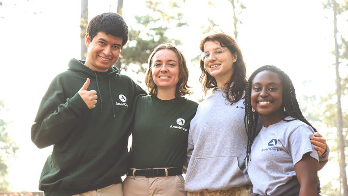
The AmeriCorps ACCESS Project is Now Accepting 2024-25 Program Year Applications. It invites Spartans who are interested in helping immigrants and refugees integrate into a new life in North Carolina.
The AmeriCorps Cross-Cultural Education Service Systems (ACCESS) Project is an AmeriCorps program under the Center for New North Carolinians at UNCG. Incepted in 1994, it is North Carolina’s oldest and longest-running AmeriCorps program. It helps immigrant and refugee families gain access to resources and support needed to integrate and become economically self-sufficient and contributing members of society.
ACCESS members commit to completing one year of community service. A service year starts September 10, 2024 and ends on August 31, 2025.
Benefits include:
Living allowance ($1,041/mo. PT & $2,083/mo. FT).
Education award to repay qualified student loans and to pay current educational expenses ($3,697.50 PT & $7,395 FT) upon successfully completing the service year (900 hrs. PT & 1700 hrs. FT).
Full-time position eligible for free health insurance, if uninsured, and eligible to apply for childcare subsidies.
Transferrable skills gained during service to boost resume.
ELIGIBILITY REQUIREMENTS
Must be a U.S. citizen, U.S. National, or a lawful permanent resident.
Be at least 18 years old.
Must undergo National Service Criminal History Checks.
Have a Social Security Card (cannot say “For Work Authorization Only”).
Have proof of education completed (i.e., high school diploma, GED, college degree, etc.). It is not a requirement to be a UNCG student. Any eligible individual is encouraged to apply.
Additional eligibility requirements will depend on the individual host sites where you are placed to perform your service.
For more information, contact Program Director Khouan Rodriguez, at khouan.cnnc@uncg.edu or call 336-256-1060 to learn more about available positions.
Today, you can find graduates of UNCG programs in over 75% of the state’s public school districts. Spartans also teach in numerous independent schools, community colleges, and universities across North Carolina.
iBelong Grants Continue to Foster Campus Inclusivity at UNCG
Posted on April 12, 2024
Fostering an inclusive environment at UNC Greensboro is in the hands of everyone on campus, but the Division of Student Affairs aims to make it easier with its annual iBelong project grants.
In the 2023-24 academic year, Student Affairs awarded funding to nearly 20 projects to promote student belonging at UNCG. The effort started in 2019 with a campus survey to learn how the University can better promote an inclusive climate. Student Affairs continues to send out the survey. In 2023, 78% of undergraduate students and 81% of graduate students report being satisfied or very satisfied with their experience at UNCG.
The iBelong projects are an effort to continue helping everyone feel a sense of belonging with students, faculty, and staff encouraged to apply for the grants. The 2022-23 projects saw the largest amount of grant awards in the program’s history.
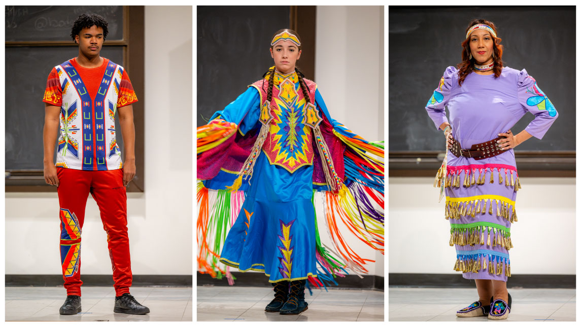
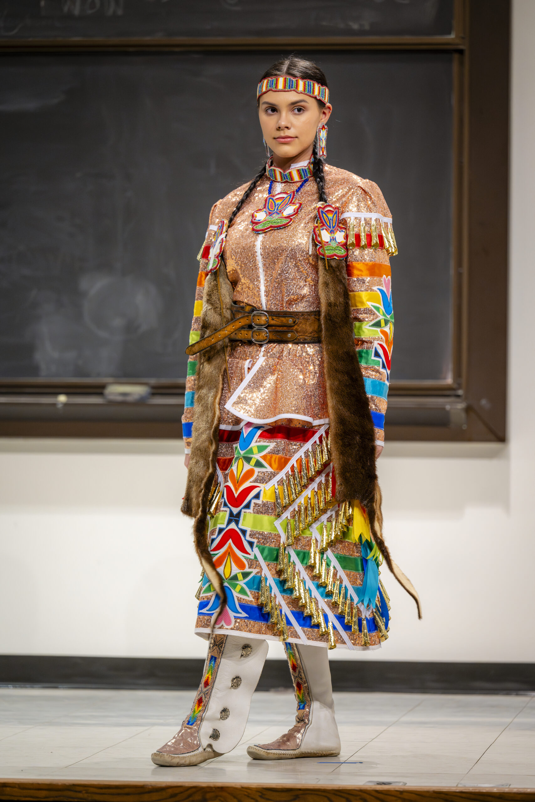
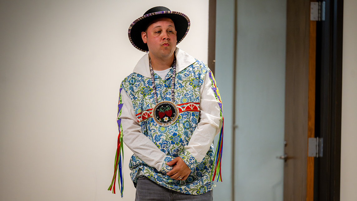
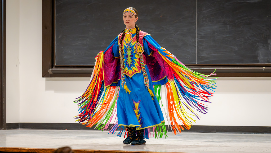
“Our Native students are some of the lowest enrolled student populations in higher education across the board, at many institutions in the United States,” says Chavis, who is a doctoral student focusing on educational studies with a concentration in higher education. “UNCG has a unique opportunity since Greensboro has a relatively large Indigenous population within the state.”
The project was NASA’s first Indigenous Fashion Show, held in the Ferguson Building in March to showcase contemporary Indigenous clothing.
“We Native students don’t get to see ourselves and our traditions around campus. We only get to see it once or twice a year at the Powwow hosted by Guilford Native American Association and the Pow Wow at UNCG. This is a time where we thought we could showcase our contemporary regalia: bearded earrings, medallions, ribbon skirts, ribbon shirts, and how we wear those in everyday life.”
As an enrolled member of the Lumbee Tribe of North Carolina, Chavis says NASA helped him find community at the University. This fashion show was a way for others to see that community and showcase Native excellence.
“Each item, even each piece of ribbon, has a special meaning to this individual, so as they walk down that runway and across the stage to show their regalia, not only is it a very impactful opportunity for the larger audience, but it’s impactful to that Indigenous student who is able to say, ‘I am a student at UNCG; there’s not a lot folks out here like me.’”
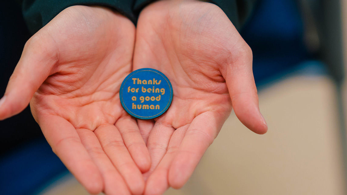
The project includes art pieces that are created in the SELF Design Studio and then handed out to UNCG community members as an act of kindness. For Fisher, the effort was born out of a need for connection during the COVID-19 pandemic. It later turned into a project of giving laser engraved magnets to people at concerts to help them enjoy their experience.
“It was awesome, but then I realized I wanted to do it every day,” says Fisher. “So, I was at my computer and the phrase ‘thanks for being a good human’ came to mind, thinking about what I would say to someone to just appreciate them. It changed how I looked at the world, so instead of looking around and seeing things that are depressing and out of my control, I look for people doing kind things just randomly out of the blue.”
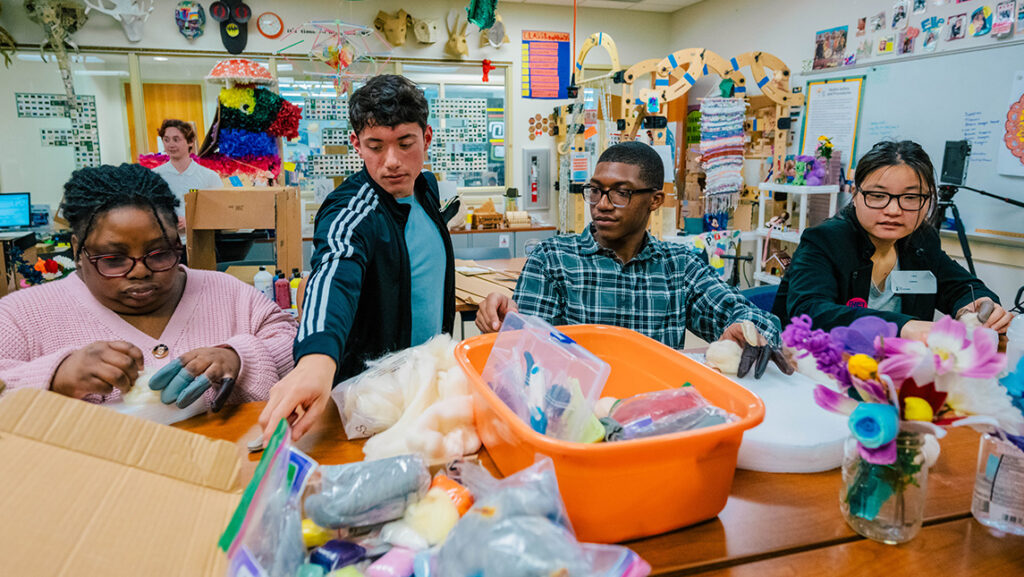
Students work in UNCG’s SELF Design Studio for the “Thanks For Being A Good Human” Project.
One of the recipients of the project was biology major Alex Nolan, who now helps Fisher with the process of creating items and giving them out.
“I was a transfer student and in the first few weeks of school I didn’t really know anybody,” Nolan says. “I was walking through the EUC and Matt approached me with this little round magnet and said, ‘I want you to have this,’ and he gave it to me and said, ‘Thanks for being a good human.’ It just made my day so much better.
The project doesn’t just include magnets. Nolan has helped create flowers out of felt along with bottle caps, key chains, and bracelets. A group meets each week to continue making items and prepare to give them out. This year’s iBelong grant has helped Fisher continue the project and increase the number of people participating.
“I wanted to create as much joy and happiness for as many people as possible,” Fisher says. “It’s nice to have the feeling that you made someone’s day.”
Story by Avery Craine Powell, University Communications Photography by Sean Norona and David Lee Row, University Communications